Light brown craft paper creates natural textures by combining an earthy base color with visible fibers, torn edges, folded relief, and layered shapes. Smooth kraft-style sheets suit drawing and clean construction, while toothier paper makes bark, soil, fur, nests, and weathered surfaces look more convincing. Choose thickness according to the build: lighter sheets crumple and fringe easily, whereas heavier stock holds raised forms. Match glue to the paper’s weight, apply it sparingly to limit wrinkles, and test markers or paint on a scrap because absorbent brown fibers can darken wet colors.
Choosing Paper by Color, Weight, and Surface
Light brown paper is most effective when its surface characteristics suit the texture being represented. A relatively smooth sheet provides a calm background for pencil lines, printed templates, or precisely cut animal shapes. Paper with visible fibers or a slightly rough tooth already suggests wood, dried grass, soil, cardboard, or animal coats before any extra detail is added. That built-in variation reduces the amount of paint or decoration needed.
Color names are not fully consistent between packages. Kraft, tan, natural, oatmeal, sand, and light brown may describe noticeably different shades. Compare the actual sheet rather than relying only on the label. Gray-brown paper tends to feel like stone or weathered wood, while warmer golden-brown paper reads more readily as straw, autumn leaves, or a woodland animal. If a project uses several brown elements, place them together under the room’s normal lighting; two shades that look distinct online may merge visually on the table.
Weight changes both appearance and behavior. Thin paper is useful for tearing, pleating, twisting, fringing, and wrapping around simple forms. It can produce delicate grass, feathers, or uneven bark, but too much liquid glue may buckle it. Medium-weight construction or kraft paper balances easy cutting with enough strength for layered collages. Heavier stock is better for standing trees, masks, folded structures, and pieces that children will handle repeatedly, although it resists fine crumpling and may spring open after a fold.
A common mistake is assuming that thicker paper automatically creates a better natural texture. Thickness supplies structure, not necessarily surface interest. A rigid, uniformly smooth sheet may look flatter than thin paper that has been torn, wrinkled, and overlapped. Choose strength for the load the piece must carry, then create the desired surface separately.
Recycled-looking fibers can support the visual effect, but inspect sheets intended for children before use. Remove paper with sharp embedded fragments, oily marks, strong odors, or unknown residue. Clean commercially sold art paper or repurposed paper from a known household source is a more predictable choice than unidentified packing material. The broader collection on Light brown craft paper for natural textures can be used to compare shades and finishes for related builds.
Creating Grain, Roughness, and Raised Texture
Natural-looking surfaces come from controlled irregularity rather than random damage. Repeating perfectly even lines often makes a tree trunk resemble a printed stripe, while varied line lengths, torn contours, and overlapping fibers suggest organic growth. The goal is to establish one dominant direction—vertical for bark, radiating for a nest, or clustered for soil—then introduce small variations within it.
Tearing is the simplest way to expose a fibrous edge. Tear slowly toward the body for a manageable contour, and turn the sheet instead of forcing a tight curve. The exposed pale edge can represent dry bark, rock strata, or fur. If the white or light inner edge is too prominent, rub it gently with a brown crayon or dry colored pencil. Cutting remains preferable when parts must fit accurately, such as tabs, hinges, or a symmetrical base.
Crumpling creates many small shadows without adding separate material. Compress a lightweight sheet loosely, open it, and flatten only the high points with a palm. Severe crumpling weakens the fibers and can make glued pieces detach, so stop while the sheet still holds together. For raised bark, make several narrow folds in the same general direction and glue only the valleys. The unglued ridges remain elevated and cast visible shadows.
Layering works best when each layer has a distinct job. A flat light brown base can establish the overall shape, darker torn strips can define crevices, and small tan scraps can highlight worn areas. Too many similar fragments create visual noise without making the texture clearer. Three deliberate surface levels—base, shadow, and highlight—usually communicate depth more effectively than a dense pile of nearly identical pieces.
For a simple tree-trunk panel, begin with medium-weight light brown paper. Add long, uneven creases from top to bottom, then attach a few darker strips that branch or stop at different heights. Finish with short pencil marks rather than outlining every ridge. By contrast, a nest needs curved torn strips layered around an open center. Using the bark technique for a nest would produce the wrong directional cue even if the colors were accurate.
Signs that the texture is working include visible depth from more than one viewing angle, secure edges, and a surface that still reads clearly from arm’s length. Failure signs include shredded weak points, pieces lifting under their own weight, or so much decoration that the brown foundation disappears. Pause before adding another layer and check whether it contributes grain, relief, or contrast; if it does none of those, it is probably unnecessary.
Matching Adhesives and Color Media to Brown Paper
Adhesive should be selected according to paper weight, contact area, and drying behavior. A glue stick is well suited to broad, flat layers because it deposits relatively little moisture. White school glue can hold heavier folded details, but a thin line or small dots are usually sufficient. Pools of glue soak into absorbent paper, producing dark patches, ripples, and long drying times.
Apply adhesive near the edges of a flat piece and add a small amount through the center. Press it under a clean scrap sheet with the palm rather than rubbing directly across textured fibers. Raised details need a different approach: glue only the points intended to touch the base. Coating an entire pleated strip flattens the relief that was meant to create bark or grass. Tape can secure hidden structural joints, but exposed glossy tape interrupts an earthy surface and may attract lint.
Dry media preserve paper texture most clearly. Colored pencils catch raised fibers and allow controlled shading. Crayons skim over high points when held sideways, producing a rubbing-like grain. Chalk or soft pastel creates dusty, muted color, though loose pigment can transfer to hands and nearby areas. Markers make stronger lines but may spread along fibers or appear much darker than expected. Place a scrap under the sheet and test a short line before using a marker on the finished piece.
Paint offers greater color coverage at the cost of more moisture. A nearly dry brush can leave broken strokes that resemble weathered wood or dirt while keeping the light brown base visible. A wet wash sinks into uncoated paper and may cause curling. If paint is necessary, use a restrained amount, paint before assembling raised layers, and let the sheet dry flat. Applying glue while painted paper is still damp compounds warping and weakens bonds.
White, cream, charcoal, rust, olive, and muted gold generally remain readable against light brown, but contrast should be checked on the actual sheet. Pale yellow pencil may vanish on a warm tan background, while black marker can dominate a delicate texture. A useful comparison test is to draw the same mark with pencil, crayon, and marker on an offcut. View the samples both close up and from the distance at which the project will be displayed.
The frequent failure mode is choosing materials independently: an appealing paper, a convenient glue, and a favorite paint may not behave well together. Build one small test stack using the planned layers and adhesive. If it dries flat, holds after gentle bending, and retains visible surface detail, the combination is suitable. More material-specific ideas are available through Light brown craft paper for natural textures.
Natural-Texture Project Examples and Build Decisions
Project design should begin with the physical quality the paper needs to imitate. Bark requires directional grooves, soil benefits from clustered fragments, fur needs fringed or overlapping edges, and a rock surface calls for angular folds rather than flowing lines. Starting with the intended surface keeps technique choices purposeful and prevents every brown-paper project from receiving the same crumpled treatment.
Woodland Animal Collage
Use a smooth, medium-weight base for the body so the outline remains recognizable. Add short fringed strips only where fur direction matters, such as along a fox’s chest, an owl’s brow, or a bear’s back. Overlap the uncut edges and leave the fringe ends free. Covering the whole animal in deep fringe can obscure facial features and create fragile edges, so reserve strong texture for selected areas.
Tree Bark and Branches
A vertical rectangle can become convincing bark through long folds, torn strips, and dry crayon shading. Heavier paper is useful when the trunk must stand, but a separate folded support is often better than making every surface layer rigid. For branches, roll or twist narrow paper strips around a pencil and release them. Attach the thicker end to the trunk, leaving the tip slightly raised. Small children may find tight twisting difficult, making broad folded branches the more manageable option.
Soil, Sand, and Nest Surfaces
Torn scraps in two or three related browns make a readable ground layer. Keep pieces larger near the foreground and smaller higher on the page to suggest depth. For a nest, curve narrow strips around a central opening and alternate their direction slightly. Real twigs may seem more authentic, but they can be sharp, dirty, or difficult to attach. Paper strips offer greater control and keep the project lightweight.
Light brown paper can also serve as the quiet element in a colorful composition. A neutral landscape base lets green leaves, blue water, or painted insects stand out without competing for attention. The misconception is that every natural-themed surface must be heavily distressed. A smooth tan sky, path, or animal silhouette may provide necessary visual rest beside rougher areas.
Choose complexity according to use. A temporary collage can rely on thin layers and glue stick. A puppet, headband, or play prop needs reinforced attachment points because bending and repeated handling concentrate stress around tabs and edges. Add a second paper layer behind those points rather than coating the whole object in extra glue. Readers comparing project roles for Light brown craft paper for natural textures should separate decorative surfaces from structural supports before selecting sheet weight.
A Practical Preparation and Quality Checklist
A short material test prevents most problems associated with absorbent paper, wet media, and layered relief. Prepare an offcut from the same sheet rather than using unrelated scrap paper; coatings, fiber density, and color can vary enough to change the result. Test under the same conditions planned for the project, including the adhesive, coloring tool, and number of layers.
- Check the shade: Place accent colors against the brown sheet under normal room lighting.
- Test the edge: Tear and cut a sample to see whether fibers look attractive or simply ragged.
- Match the weight: Bend the sheet and confirm that it can hold the intended shape without cracking or collapsing.
- Trial the glue: Join two sample layers, let them dry, and check for rippling or dark wet marks.
- Sample the color: Compare dry pencil or crayon with any planned marker or paint.
- Check handling: Flex the dried sample gently to identify loose corners and weak raised details.
Preparation should also account for how children will work. Precutting structural slots or thick support pieces may be sensible when the learning goal is texture rather than difficult cutting. Tearing, rubbing, folding, and arranging can remain child-led. Scissors, staplers, small decorations, and liquid adhesives should be selected and supervised according to the child’s age and ability.
A finished piece is ready when its natural surface reads clearly, the main silhouette remains identifiable, and attached parts stay in place during ordinary handling. Curling at one corner can often be corrected by adding a small amount of glue and pressing it beneath a clean sheet after the wet media have dried. Widespread buckling usually cannot be fixed by adding more glue; mount the dry work onto firmer backing instead.
Do not judge success by the number of techniques included. One directional fold pattern with restrained shading often communicates bark better than folds, paint, glitter, string, and tissue applied together. The strongest result keeps the light brown foundation visible and uses each added material to clarify a particular natural feature.
Frequently Asked Questions
Is light brown craft paper the same as kraft paper?
Not always. Kraft commonly describes a brown paper with a natural, utilitarian appearance, while light brown craft paper may include smoother, dyed, or heavier sheets. Compare the actual color, surface, and weight.
Which paper weight is best for textured children’s projects?
Medium-weight paper is the most versatile for cutting, tearing, folding, and layering. Use lighter sheets for crumpling or fringe and heavier stock for standing parts or frequently handled props.
How can brown paper look like tree bark?
Create long uneven folds, add a few torn darker strips, and rub crayon lightly across raised areas. Keep most marks vertical, but vary their length and spacing.
What glue causes the least wrinkling?
A glue stick usually causes less wrinkling on flat paper layers because it adds little moisture. Use small amounts of white glue when raised or heavier pieces need a stronger bond.
Can paint be used without hiding the natural paper texture?
Yes. Use a nearly dry brush and broken strokes so the brown fibers remain visible. Test first, avoid soaking the sheet, and let painted pieces dry before assembly.
Conclusion
Successful natural-texture work begins by matching the sheet to its job. Select thin paper for fringe and crumpling, medium weight for general collage, and heavier stock only where the structure must stand or withstand handling. Build organic surfaces with controlled irregularity: orient folds and scraps according to bark, fur, soil, or nest patterns rather than adding random distress.
Test glue and color on an offcut before committing to the finished piece. Sparse adhesive, dry coloring media, and selective layering preserve the fibers and reduce curling. If the surface becomes weak, wet, or visually crowded, stop adding materials and reinforce only the necessary attachment points. A clear silhouette, secure layers, and visible brown grain are better measures of success than the number of decorative techniques used.
Now retrieving an image set.
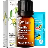
Vanilla Oleoresin Essential Oil for Skin, Hair & Diffuser - 0.34 Fl Oz | Vanilla Oil for Hair, Aromatherapy & DIY, Long-Lasting Sweet Scent, Natural Fragrance Oil - Gya Labs
$9.99 (as of October 21, 2026 23:20 GMT -04:00 - More infoProduct prices and availability are accurate as of the date/time indicated and are subject to change. Any price and availability information displayed on [relevant Amazon Site(s), as applicable] at the time of purchase will apply to the purchase of this product.)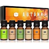
Now retrieving an image set.
P&J Fragrance Oil Autumn Set | Brown Sugar, Apple, Harvest Spice, Vanilla, Forest Pine, and Snickerdoodle Candle Scents for Candle Making, Freshie, Soap Making Supplies, Diffuser Oil Scents
$16.99 (as of October 21, 2026 23:20 GMT -04:00 - More infoProduct prices and availability are accurate as of the date/time indicated and are subject to change. Any price and availability information displayed on [relevant Amazon Site(s), as applicable] at the time of purchase will apply to the purchase of this product.)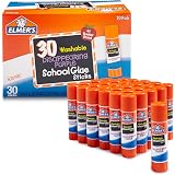
Now retrieving an image set.
Elmer's Disappearing Purple School Glue Sticks, Washable, 7 Grams, 30 Count - Posters, Back to School, Bulk Pack for Classrooms, #1 Teacher Brand
$9.97 (as of October 21, 2026 23:20 GMT -04:00 - More infoProduct prices and availability are accurate as of the date/time indicated and are subject to change. Any price and availability information displayed on [relevant Amazon Site(s), as applicable] at the time of purchase will apply to the purchase of this product.)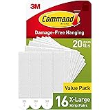
Now retrieving an image set.
Command 20 lb X-Large Picture Hanging Strips, 16 Pairs White Command Strips Heavy Duty Picture Hanger
$10.39 (as of October 21, 2026 23:20 GMT -04:00 - More infoProduct prices and availability are accurate as of the date/time indicated and are subject to change. Any price and availability information displayed on [relevant Amazon Site(s), as applicable] at the time of purchase will apply to the purchase of this product.)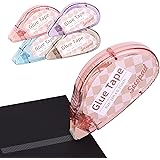
Now retrieving an image set.
Secopad Scrapbook Tape, Glue Tape for Crafts, 4 Pack, Light-Colored Shell | 0.3IN x 26FT, Sticky & Safe, Double Sided Tape for Crafts, Scrapbooking Junk Journaling Supplies, For School Office Teachers
$7.99 (as of October 21, 2026 23:20 GMT -04:00 - More infoProduct prices and availability are accurate as of the date/time indicated and are subject to change. Any price and availability information displayed on [relevant Amazon Site(s), as applicable] at the time of purchase will apply to the purchase of this product.)
Now retrieving an image set.